
Table of Contents
Font choice, much like color choice, is an important part of both graphic design and branding that can completely change the tone of a piece of content. While font size provides a visual structure for readers, the weight, texture, and shape of a font combine to determine how we perceive the text. These characteristics of typography play a large part in telling the story behind a message.
Typeface vs Font
- Typeface: A group of related fonts, for example, Helvetica
- Font: A specific font in a typeface that indicates the weight and other details, such as Helvetica Neue 45 Light
Why is Typography Important?
How you say something is just as important as the words themselves. Anyone who has been told “OK, fine” can attest to that—depending on the tone, it can mean there’s no problem, or that there definitely is one. When talking to someone in person, the slightest inflection can completely change the meaning of what someone says, and it is no different with the written word. Type out “could this line be any longer?” and you can practically hear the frustration in your head. Change it to “could this line be any longer?” and you’re suddenly hearing Chandler Bing from Friends.
The words are the same, but the format changes the interpretation. Using typography intentionally can help communicate meaning, convey emotions, and tell a meaningful story.
For instance, I get greeted three ways in the morning. I can give you an idea of how they differ using font:
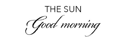
An elegant script, even digitally, carries the same emotions needed to write in that style—calm, gentle, soft, organic. The sun is a slow greeting.
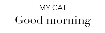
Didot fonts provide the elegant tapering of a calligraphic script with the clean sophistication of typed text. Being a tuxedo, my cat greets me formally with a great deal of class. This is inevitably followed by demands for breakfast.
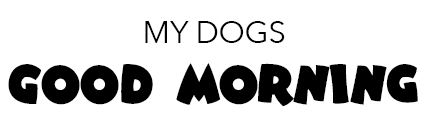
The thick, inconsistent shapes that make up these letters are loud and exciting. This matches well with the play tackles I receive from my pups as they bounce around the room.
Typography for Your Brand
A main typeface is a staple for your brand identity . Within your chosen typeface, you’ll probably want different fonts that are lighter and bolder. Finding the right typeface can take time, so test out a few different styles in various pieces of content.
Design elements that you should consider the font for include:
- Logo design: Often what makes the first impression on people. What do you want people to feel when they see your logo?
- Internal communication: The typography used on internal newsletters, handouts, and other materials should back up your company’s culture.
- Content of varying sizes: Using a thin, script font isn’t ideal for large items such as billboards. Likewise, a wide, bold font would clutter up the design of a website on a mobile device.
Thanks to platforms such as Google , Adobe , and Envato , you can browse through thousands of options to find the right font for your brand. Or, if you have a design in mind that hasn’t been created yet, you can start from scratch. Designing a brand new font style can be time-consuming, so ensure you’ve done research and are confident in your choice.
Expressing Common Emotions with Typography
From personal touches to firm statements, there’s a font to help express almost any emotion. Here are a few tips for communicating common emotions through typography.
Personal/Casual
These fonts often look handwritten, including some script fonts, and have rough edges or other imperfections that make them appear more approachable and friendly. These fonts express sincerity.
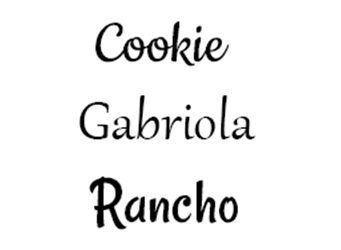 Warm/Welcoming
These fonts also have a handwritten touch but are cleaner and more refined.
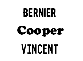 Bold/Tough
These fonts often use all capital letters with heavy weights and no tapering edges. They can have a rough texture but appear more like a stamp than handwritten.
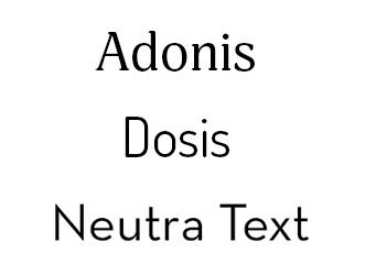
Professional/Knowledgeable
These are clean, light, and modern fonts that are easy to read. Unlike the more decorative fonts above, their visual appearance is a bit understated to let the words themselves have more of the focus.
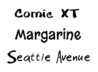
Playful/Childlike
These fonts are a bit…wonky. They often have inconsistent thickness and chunky letters. While they can be handwritten, they look as if they were written by a kid.
Recognizing Font as a Design Element
It’s important to remember that your marketing messages can be interpreted in different ways. Strategically choosing the font for each piece of content you create and market will help your audience understand the story being told. This makes your marketing clear and helps ensure your message is heard.
There are also general adjustments to any font, including weight, italics, and capitalization that can change the tone. So, next time you’re about to use Calibri or Times New Roman because they’re default fonts, try to see if another font would convey more emotion and make the difference between “How you doing?” and “How you doing?”
Need help piecing together fonts and other design elements for your brand? Learn more about our approach to branding or contact us to see how we can help!
Related: Visual Weight Matters in Marketing , Not All Fonts are Created Equal , Conveying Emotions Through Colors